On Proteomics Research Trends
A view from the PRIDE Archive
PRIDE Archive Annual Trends - Exploratory Data Analysis
Jose A. Dianes
20 March 2015
Requisites
These are some of the libraries and configurations we will use in the following analysis.
require(devtools)
install_github("PRIDE-R/prideR")
library(prideR)
require(ggplot2)
theme_set(theme_linedraw())
require(dplyr)
A draft of the pipeline
The two first parts are carried out in this document. The data visualisation part will be generated and published separately and referenced from here.
Data acquisition
We will use the prideR package to retrieve data from all the submitted experiments up to date.
Exploratory Data Analysis
By using R, first we will prepare and explore data to be mined. Then we will
compute different summary statistics and generate some plots that will give us
some insight into the questions we want to answer in our visualisation.
Data Visualisation
For this data viz we will use Tableau. We will generate some worksheets for the key charts, and then we will put them together in an author-driven linear narrative that will go over time answering questions about MS2 proteomics research trends.
Data acquisition
Using prideR, lets retrieve all the public datasets. We will use a large number as page size so we retrieve all of them.
all_projects <- search.list.ProjectSummary("",0,20000)
num_projects <- length(project.list(all_projects))
This time we get 1331 projects in total. Lets convert the result object into a data frame, more suitable to work with the different R libraries.
all_projects.df <- as.data.frame(all_projects)
names(all_projects.df)
## [1] "accession" "project.title" "project.description"
## [4] "publication.date" "num.assays" "species"
## [7] "tissues" "ptm.names" "instrument.names"
## [10] "project.tags" "submissionType"
Let's have a look at the publication dates.
str(all_projects.df$publication.date)## POSIXct[1:1331], format: "2015-03-19" "2015-03-19" "2015-03-19" "2015-03-19" ...
We see they are already in date format (POSIXct) and contain month and day. But we are just
interested in years in our study of trends, so let's extract the year in a separate
variable in the data frame.
all_projects.df$publication.year <- as.factor(format(all_projects.df$publication.date, "%Y"))
table(all_projects.df$publication.year)
##
## 2005 2006 2007 2008 2009 2010 2011 2012 2013 2014 2015
## 6 12 18 22 52 75 112 181 255 485 113
We have a lot of information in that summary table. But let's put it visually.
ggplot(data=all_projects.df, aes(x=publication.year)) +
    geom_bar()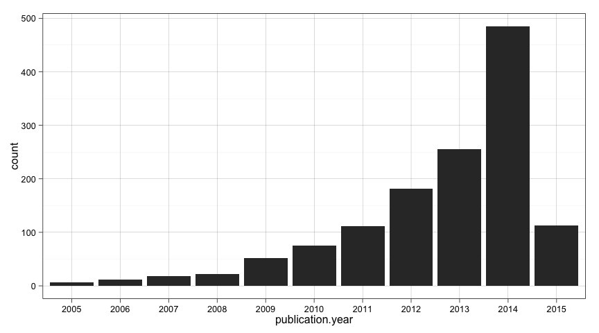
Maybe we should exclude the present year from our trend analysis since the year is not complete and will incorrectly influence the outcomes.
all_projects_up2014.df <- subset(all_projects.df, publication.year!="2015")
num_projects_up2014 <- nrow(all_projects_up2014.df)
There we are. We have a new dataframe with 1218 projects up to 2014. I think we are ready to start doing some Exploratory Analysis.
Exploratory Data Analysis
So we know how the number of publications has changed over the years. But we are also interested in what people research during these years. From the names in our data frame we saw that each project includes information regarding:
- Species
- Tissues
- Modification names
- Instrument names
Let's first have a look at each of these variables as a whole, and later on we can group them by years. We will repeat the analysis fir each variable.
Species
species_table <- sort(table(all_projects_up2014.df$species), decreasing=T)
species_table_frequent <- species_table[species_table>10]
num_species <- length(species_table)
num_species_frequent <- sum(species_table>10)
We see that we have up to 312 different species. But most of them are rare species that appear just once or twice. Just 10 of them have been submitted more than ten times. Let's plot them.
ggplot(data=subset(all_projects_up2014.df, species %in% names(species_table_frequent))) +
       aes(factor(species, levels=names(species_table_frequent))) +
    geom_bar() + coord_flip( )+
    ylab("Number of publications") +
    xlab("") +
    ggtitle("Per Species project publications")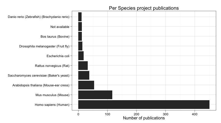
But how this distributes over time? Let's consider just publications after 2009.
ggplot(
    data=subset(all_projects_up2014.df,
                publication.year %in% factor(c("2009","2010","2011","2013","2014")) &
                    species %in% names(species_table_frequent)),
       aes(
           factor(species, levels=names(species_table_frequent))
           )
    ) +
    geom_bar() + coord_flip() +
    facet_grid(. ~ publication.year) +
    ylab("Number of publications") +
    xlab("") +
    ggtitle("Per Species and Year project publications (2009-2014)")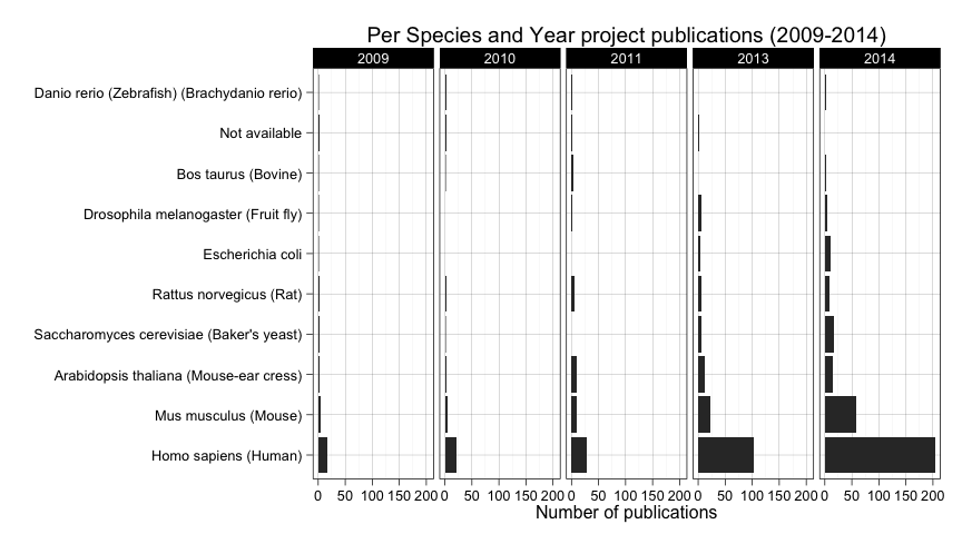
It seems clear that human is the most prevalent species, so lets remove it so we can compare the rest of the species more easily.
ggplot(
    data=subset(all_projects_up2014.df,
                publication.year %in% factor(c("2009","2010","2011","2013","2014")) &
                    species %in% names(species_table_frequent) &
                    species != "Homo sapiens (Human)"),
       aes(
           factor(species, levels=names(species_table_frequent))
           )
    ) +
    geom_bar() + coord_flip() +
    facet_grid(. ~ publication.year) +
    ylab("Number of publications") +
    xlab("") +
    ggtitle("Per Species and Year project publications (2009-2014)")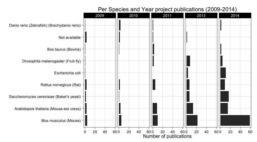
Among other things, we can see how Mus musculus (Mouse) has boosted its popularity in 2014. It also seems to be a constant increase of Rat novergicus (Rat) over time but it is decaying lately in favor of species such as Escherichia coli and Saccharomyces cerevisiae (Baker's yeast) as we can see in 2013 and 2014.
Tissues
Let's repeat a similar analysis for tissues and see what we find.
tissues_table <- sort(table(all_projects_up2014.df$tissues), decreasing=T)
tissues_table_frequent <- tissues_table[tissues_table>10]
num_tissues <- length(tissues_table)
num_tissues_frequent <- sum(tissues_table>10)
In this case we have up to 143 different tissues. Just 10 of them have been submitted more than ten times. Let's plot them.
ggplot(data=subset(all_projects_up2014.df, tissues %in% names(tissues_table_frequent))) +
       aes(factor(tissues, levels=names(tissues_table_frequent))) +
    geom_bar() + coord_flip( )+
    ylab("Number of publications") +
    xlab("") +
    ggtitle("Per Tissues project publications")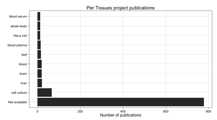
A lot of submissions did not specify a tissue. It also happens with species, but before wasn't so prominent. In this case we need to filter these out.
ggplot(data=
           subset(
               all_projects_up2014.df,
               tissues %in% names(tissues_table_frequent) &
                tissues != "Not available"
               )
       ) +
       aes(factor(tissues, levels=names(tissues_table_frequent))) +
    geom_bar() + coord_flip( )+
    ylab("Number of publications") +
    xlab("") +
    ggtitle("Per Tissues project publications")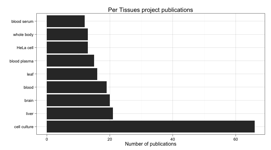
It seems that most people use cell cultures as a tissue, and that makes sense. But out of that we see some popular tissues such as liver, brain, blood, etc. We will try to make sense of it later on.
But now let's have a look at these numbers per year, again considering just the period 2009-2014.
ggplot(
    data=subset(all_projects_up2014.df,
                publication.year %in% factor(c("2009","2010","2011","2013","2014")) &
                    tissues %in% names(tissues_table_frequent) &
                tissues != "Not available"),
       aes(
           factor(tissues, levels=names(tissues_table_frequent))
           )
    ) +
    geom_bar() + coord_flip() +
    facet_grid(. ~ publication.year) +
    ylab("Number of publications") +
    xlab("") +
    ggtitle("Per Tissues and Year project publications (2009-2014)")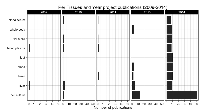
Two conclusions here. First, submissions started to include more metadata regarding tissues in 2014. And second, numbers are too low actually to arrive to any conclusion about trends out of the fact that most people uses cell cultures. Maybe leaf stands out a little bit in 2014 considering it doesn't appear un the three previous years. But again, we cannot arrive to any actual conclusions when there isn't enough submissions containing this piece of metadata.
Modifications
Our third analysis deals with what modifications are associated with a dataset. We will repeat the same procedure.
ptm_table <- sort(table(all_projects_up2014.df$ptm.names), decreasing=T)
ptm_table_frequent <- ptm_table[ptm_table>10]
num_ptm <- length(ptm_table)
num_ptm_frequent <- sum(ptm_table>10)
We have up to 76 different modifications. Just 17 of them have been submitted more than ten times. Let's plot them.
ggplot(data=subset(all_projects_up2014.df, ptm.names %in% names(ptm_table_frequent))) +
       aes(factor(ptm.names, levels=names(ptm_table_frequent))) +
    geom_bar() + coord_flip( )+
    ylab("Number of publications") +
    xlab("") +
    ggtitle("Per Modification project publications")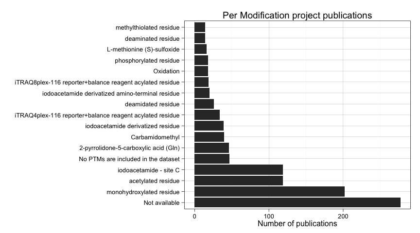
Let's filter out unspecified modifications and plot again.
ggplot(data=
           subset(
               all_projects_up2014.df,
               ptm.names %in% names(ptm_table_frequent) &
                ptm.names != "Not available" &
                ptm.names != "No PTMs are included in the dataset"
               ),
       aes(factor(ptm.names, levels=names(ptm_table_frequent)))) +
    geom_bar() + coord_flip( )+
    ylab("Number of publications") +
    xlab("") +
    ggtitle("Per Modification project publications")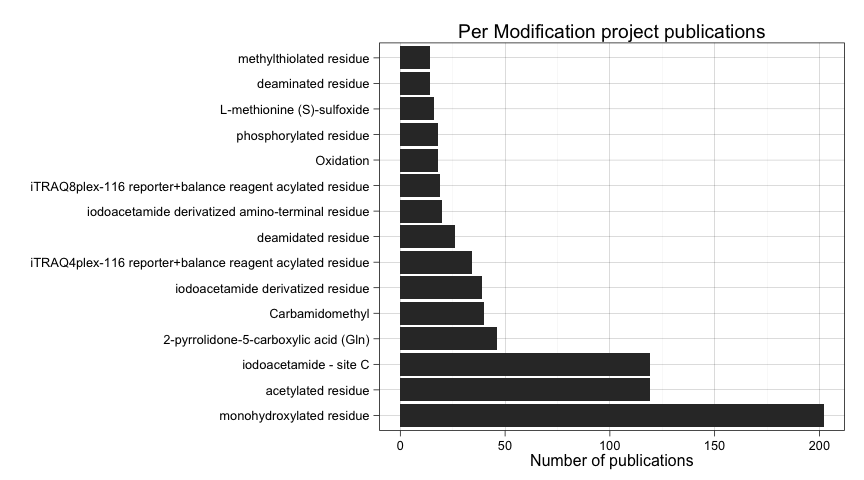
Three modifications stand out from the rest, specially monohydroxylated residue, but also acetylated residue, and iodacetamide - site C.
But now let's have a look at these numbers per year, again considering just the period 2009-2014.
ggplot(
    data=subset(all_projects_up2014.df,
                publication.year %in% factor(c("2009","2010","2011","2013","2014")) &
                    ptm.names %in% names(ptm_table_frequent) &
               ptm.names != "Not available" &
                ptm.names != "No PTMs are included in the dataset"
               ),
       aes(factor(ptm.names, levels=names(ptm_table_frequent)))
    ) +
    geom_bar() + coord_flip() +
    facet_grid(. ~ publication.year) +
    ylab("Number of publications") +
    xlab("") +
    ggtitle("Per Modification and Year project publications (2009-2014)")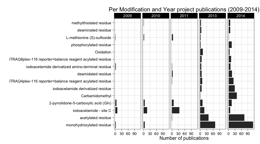
Here we see some trend changes. First of all, the high frequency of monohydroxylated residue seems to be a consequence of 2013 and 2014 publications. A similar thing happens with acetylated residue. In the case of iodacetamide - site C, it is the most frequently reported modification before 2013, but in 2013 and 2014 is less reported. In 2014 we see an increase of submissions in iodoacetamide derivated residue and carbamidomethyl that from being rarely reported became the third most reported modification with 40 datasets made public in 2014.
Instruments
Finally we will have a look at what instruments have been reported to be used in PRIDE Archive public experiments.
instrument_table <- sort(table(all_projects_up2014.df$instrument.names), decreasing=T)
instrument_table_frequent <- instrument_table[instrument_table>10]
num_instrument <- length(instrument_table)
num_instrument_frequent <- sum(instrument_table>10)
We have up to 164 different instrument names. Just 17 of them have been submitted more than ten times. Let's plot them.
ggplot(data=subset(all_projects_up2014.df, instrument.names %in% names(instrument_table_frequent))) +
       aes(factor(instrument.names, levels=names(instrument_table_frequent))) +
    geom_bar() + coord_flip( )+
    ylab("Number of publications") +
    xlab("") +
    ggtitle("Per Instrument project publications")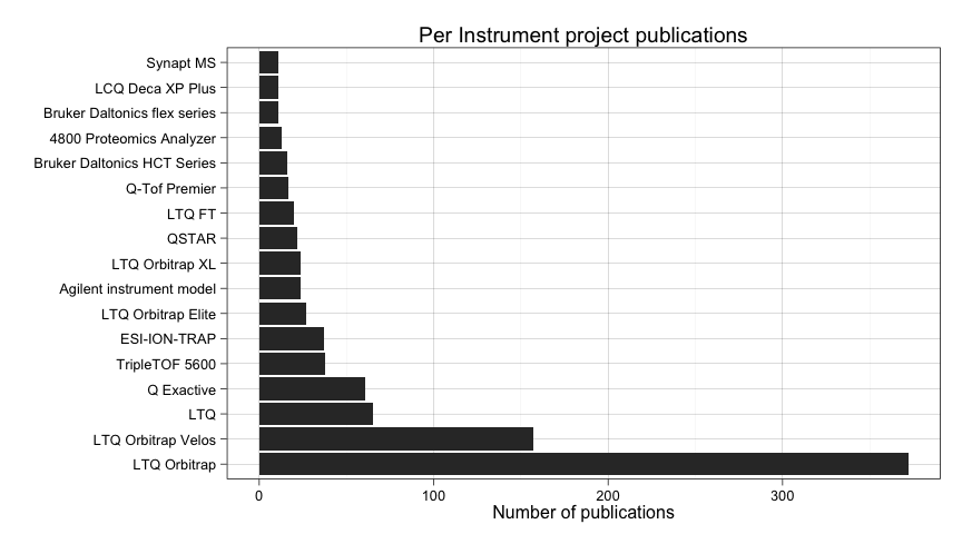
Not much here. It seems that different versions of LTQ Orbitrap are the most prevalent instrument reported.
Lets see if there is any different in a per year chart. Again considering just the period 2009-2014.
ggplot(
    data=subset(all_projects_up2014.df,
                publication.year %in% factor(c("2009","2010","2011","2013","2014")) &
                    instrument.names %in% names(instrument_table_frequent)
               ),
       aes(factor(instrument.names, levels=names(instrument_table_frequent)))
    ) +
    geom_bar() + coord_flip() +
    facet_grid(. ~ publication.year) +
    ylab("Number of publications") +
    xlab("") +
    ggtitle("Per Instrument and Year project publications (2009-2014)")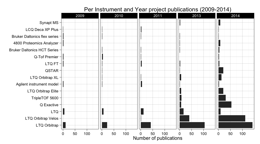
Maybe we can mention as something interesting that LTQ Orbitrap Velos is being reported more frequently in 2014 and there is also an increase of usage of Q Exactive in the same year.
Conclusions
In order to interpret most of these results, a good knowledge of the field is needed. This is needed to relate different trends in the biological data: species, tissues, and modifications. But also it could be possible to relate instruments with trends in the previous?
In any case, due to the increasing popularity of PRIDE Archive as a proteomics experimental results repository, we will be able to see actual trends in the datasets in the years to come. Or at least we will be more confident on what has been observed here. The reason is not just that the number of submissions is increasing, but also that the platform is being improved in order to gather more metadata related with the experiments. Moreover, users get more familiar with the process, being easier for them to provide this information.
Data Visualisation
As we introduced, we plan to create a data visualisation using Tableau. The idea is to show a report for each of the years including stats for each of the variables analysed here. The user will be able to navigate through each year and maybe see any existing trends in the field.
TODO